“Close enough” is sufficient only in horseshoes and hand grenades; your pricing page is no exception.
If your pricing page isn't perfectly designed to convert potential customers, all that effort you put into sales, marketing, and product development might as well be for naught.
Unfortunately, all too many early-stage startups fall into the trap of pouring everything they have into their product and only hastily slap together their pricing page as an afterthought.
We've reviewed thousands of pricing pages: some great, most mediocre, and a few we'd rather forget. The best pricing pages we've seen weren't built overnight—instead, they all follow a few key design principles and measure their success with hard metrics.
To help you design the perfect pricing page for your subscription company, we're taking a closer look at some of the best pricing page examples, the design principles each company follows, and how they measure success.
Before we start, though, let’s take a quick refresher on why pricing pages are so important.
What is a pricing page?
In a nutshell, your pricing page is the landing page on your website that lists the different pricing options or tiers available to customers and the benefits and features included in each tier. Your pricing page is the most important page on your website—without a well-designed pricing page, you’ll find yourself losing conversions and potential revenue.
Read the industry-defining pricing strategy handbook from the Price Intelligently team
While many companies list pricing on their website, in this post, we’re specifically talking about pricing pages for subscription-based products or services, like SaaS companies.
The anatomy of a pricing page
Hiten Shah has been at the forefront of SaaS product and marketing for the past two decades. Besides being my partner-in-crime for our new show Tradeoffs, Hiten partnered up with me a while back to execute the SaaS DNA Project, the first major study that looked at the anatomy of SaaS pricing pages.
In partnership with UserTesting.com, we studied 30 different SaaS pricing pages spanning all types of SaaS, from customer relationship management (CRM) and social media marketing to analytics and email marketing. The companies we chose serve customers of all sizes—from individual business users to small and medium businesses (SMB) to the enterprise.
I highly recommend you take a half-hour to read the complete study since it’s packed with useful information we don’t have space to list here. In essence, though, the pricing pages we reviewed all included some combination of the following components:
- 100% of sites analyzed offer a free trial
- 93% offer enterprise or customizable plan options
- 76% give the option to contact sales or support for more questions
- 66% include a FAQs section on the pricing page
- 43% offer freemium plan options
- 13% have a live chat popup
As it turned out, even though most pricing pages included some or all of the above components, the components making up a pricing page don’t always correlate to pricing page success.
Instead, the study measured successful pricing pages through user evaluations of two key factors:
- Ease of understanding; and
- Ease of choosing a plan.
The first indicates how well they understood the different plans on offer, and the second shows how they would use that information to make an informed decision about the product and their needs.
Best practices behind successful pricing pages
The most successful pricing pages don’t have to be visually stunning or show you absolutely every feature your product has to offer—in fact, simplicity and less information often perform better. The most successful pricing pages (and the highest-rated in our study) all follow a few simple practices you can steal for your own pricing page designs:
- Keep it simple.
- Publish your pricing.
- Align each tier with one target buyer persona.
- Let your brand personality shine through.
- Center pricing around your value metric.
Let’s take a look at each in more detail, along with a few examples of near-perfect pricing pages you can steal from when designing your own pricing page.
1. Keep it simple
While simpler pricing pages are almost always better than complicated ones, it isn’t that ... well, simple.
One of the key findings from the SaaS DNA Project: The Anatomy of a SaaS Marketing Site was that, even for tech-savvy customers, SaaS sites could be confusing. If people weren’t able to find the information they needed quickly and clearly, they would leave.
But, you need to balance the need for simplicity against making sure customers have all the information they need to make an informed decision. Any ambiguity here about what they are going to be getting for that money each month will drastically increase their chances of not signing up.
This means no more 20-row comparison tables between your company and your competitors. Keep it simple with a few sentences on what the tier provides, the pricing, and how to sign up.
Campaign Monitor: A masterclass in simple design
Email marketing tool Campaign Monitor’s pricing page was rated highly by users in the SaaS DNA Project because their pricing page contained all the data necessary for consumers to make an informed buying decision.
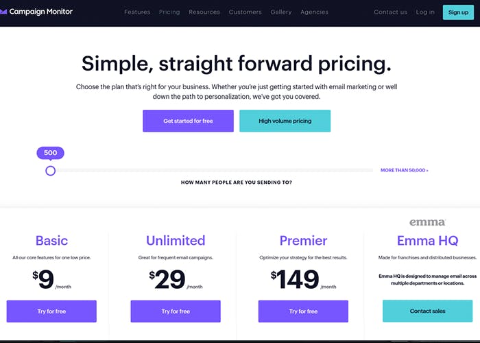
Campaign Monitor’s pricing page is a masterclass in simple design.
It’s super clear what each plan actually delivers. Key features per plan are emphasized and made obvious in bold. More complicated features are clarified with tooltips that users hover over for more information.
The page also includes another hidden trick: there might only appear to be two options for their pricing plan—but there are really 14. Part of Campaign Monitor’s pricing is charging per tier of email subscribers in your list, but the two options remain consistent across each tier of subscribers. The only thing that changes is the price. This way, users can click around and see pricing based on how many email subscribers they have without being overwhelmed by choice.
2. Publish your pricing
It seems simple, but many websites won’t list even a single tier that has definitive pricing behind it. Why? Well, keeping your pricing under wraps is a great strategy if you aren’t in the business of, you know, making sales.
We’ve said before that keeping your pricing a secret is overrated. While there are a small number of situations where you should definitely conceal your pricing, the default setting should be putting your prices out there for all the world to see.
Publishing your pricing builds consumer confidence, shows the value of your product, and greatly increases the chances of potential customers whipping out their credit cards. There’s no reason to keep potential customers in the dark.
Hightail: Transparency in pricing builds trust
Like Campaign Monitor, file-sharing and collaboration tool Hightail’s pricing page excels in its simplicity—but the real highlight here is the transparency around pricing.
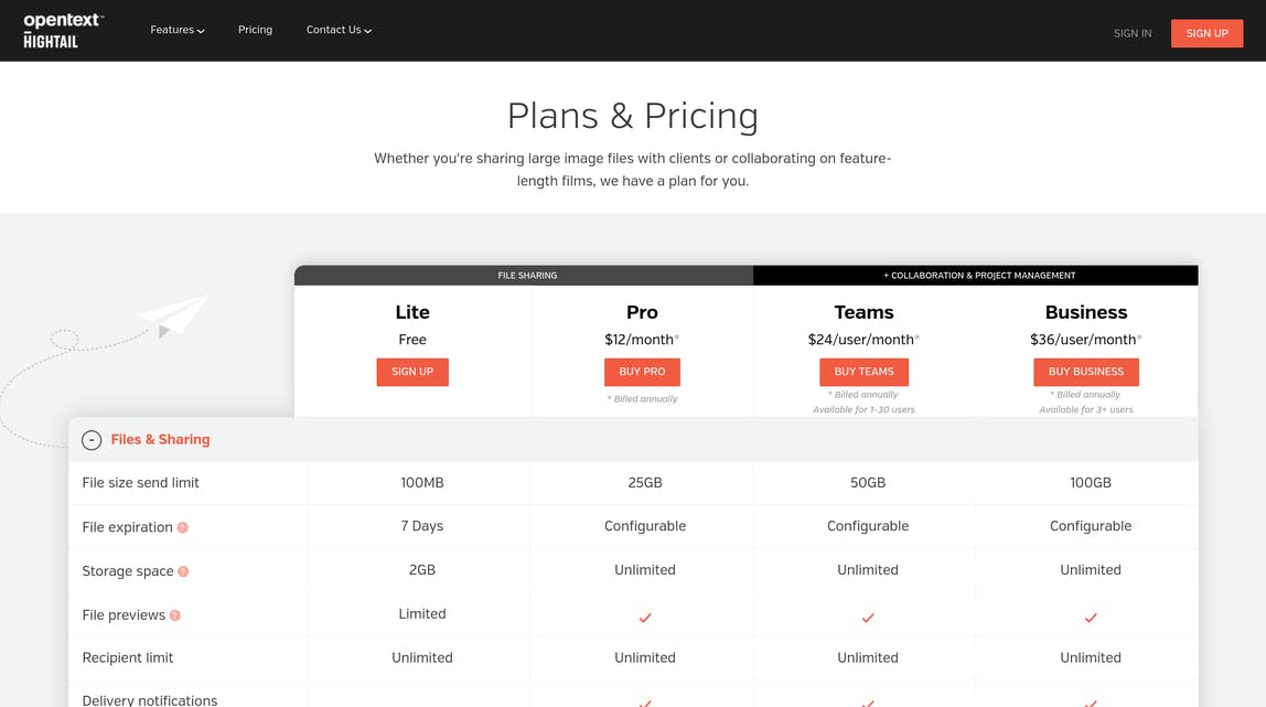
Hightail’s pricing page offers four separate plans:
- Lite (available for free)
- Pro ($12/mo, billed annually)
- Teams ($24/user/mo, billed annually)
- Business ($36/user/mo, billed annually)
Even for the highest-level Business tier, it’s immediately clear what each tier includes and how much it costs. Each tier aligns with Hightail’s value metric, making the value immediately clear to visitors. In this case, Hightail is charging based on file storage per month and file size allowable—both of which are well-understood value metrics.
Further down the page, we also find an easy-to-understand FAQs section and a selection of the features you get with each plan. This uncomplicated layout, understandable value metric, and transparent pricing mean that Hightail’s pricing is easy to understand—even for new users.
3. Align each tier with one target buyer persona
Quantifying your buyer personas is a crucial part of your pricing strategy—so crucial, in fact, we dedicated two entire sections of our 140-page eBook on SaaS pricing strategy to it. Having properly quantified buyer personas means you can align each of your pricing plans to a single customer persona, both in terms of packaging (i.e., what’s included) and the number you’re actually charging.
At a minimum, each of your buyer personas should have three elements:
- Demographic data: The size and type of your target company along with specific titles, role definitions, and challenges for individuals who work there.
- Valued features: The results from your feature-value analysis. Each buyer persona will value features differently than others.
- Willingness to pay: Price sensitivity data from your market research showing pricing ranges that each buyer persona will pay for their most valued features and/or their positioning on your value metric scale.
Your pricing page is where all that labor and research finally bear fruit. If you’ve effectively conducted your market research, this information can be translated directly onto your pricing page, and plans on your pricing page should map to a single buyer persona, making it easier for potential customers to find the right plan for them.
HubSpot: Lockstep persona-pricing fit
HubSpot practically invented the concept of “inbound marketing,” selling a software platform that helps you do just about everything from managing and tracking your SEO traffic to creating workflows and drip campaigns for your leads.
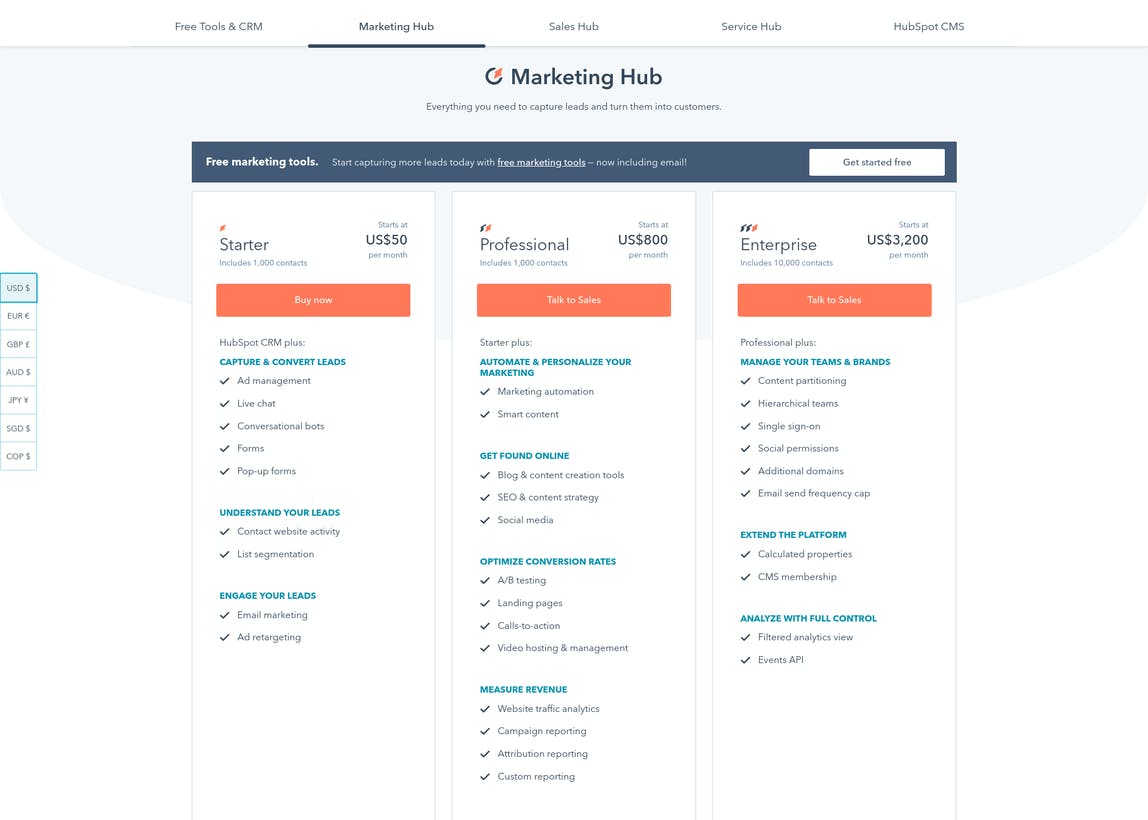
The complex nature of their platform only makes formulating a pricing strategy and creating a clear pricing page more difficult— but HubSpot gets a lot right with their pricing, chief of which is how well their tiers align with their buyer personas.
From the price points to the value metric throttles and feature splits, each package is very different, and potential customers instinctively know which tier is right for them. For instance, someone who isn’t interested in hierarchical teams probably doesn’t need more than 1,000 contacts because the volume of their marketing site isn’t as high.
Aligning their plans this way means HubSpot’s sales staff can quickly funnel leads into the plan that’s right for them while also eliminating uncertainty for potential customers. It’s a win-win.
4. Let your brand personality shine through
Your pricing page is the most important page of your marketing site, so it’s a great place to let your flag fly high with the right UX. Don't be afraid to let a little brand personality shine through—if potential customers have reached that point in the sales process, it's likely because they trust your brand, and an incongruous sales page is the last thing you need.
Read the industry-defining pricing strategy handbook from the Price Intelligently team
Keep your color schemes on your pricing page the same as the rest of your site and brand. You can also show a bit of personality through creative tier names—instead of just calling your tiers “Basic, Standard, and Premium,” try going for more memorable names to help your pricing plans stick in potential customers’ heads.
Freshdesk: Pricing made fun and friendly
Help desk platform Freshdesk lets their fun and friendly personality shine through on their pricing page.
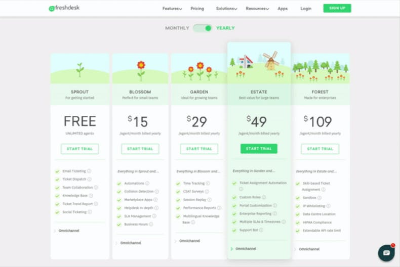
There's a lot to love here:
- Pricing for each tier is clearly laid out and is available for both monthly and annual contracts.
- Each tier includes a clear CTA to sign up for a free trial, increasing acquisition.
- Tier names aren’t your standard “Basic / Standard / Premium”—instead, they’re a bit more fun, sticking with the garden theme throughout.
- The cute windmill animation certainly makes the best-value Estate tier stand out.
- Higher tiers don’t reiterate features from lower tiers, keeping the layout simple.
- Valuable add-ons like Field Service Management and Day Passes are available right from the pricing page.

If we were to have one criticism of Freshdesk’s pricing page, it’s that five tiers feel overwhelming. They could potentially combine the $15/mo and $29/mo tiers into the same mid-tier plan and the $49/mo and $109/mo tiers into the same high-tier plan, reducing complication and increasing conversions. But that’s a question for your data.
5. Center pricing around your value metric
I could beat this drum all day—your value metric needs to be at the heart of your pricing strategy.
A value metric is essentially what you’re charging for in your service and how you are charging. You provide a certain amount of functionality tied to value (like some number of emails, keyword searches, or users), and they pay you in return. With a value-based pricing strategy, the more your customer uses the highest-value part of your product, the more they pay.
Though each pricing tier can have different features, you should feature your value metric prominently on your pricing page. This is critical for providing a clear path to expansion revenue: every time your customer's usage increases, you have an opportunity to upsell them on a more expensive (and valuable) plan.
Slack: Value-based pricing at its finest
I’ve said before that Slack has the holy grail of B2B pricing, and Slack's pricing page is a shining star in a world of mediocre designs.
Their free tier gives teams flexibility to get started (besides acting as the perfect acquisition model), but their premium tiers bring a ton of features to the table.
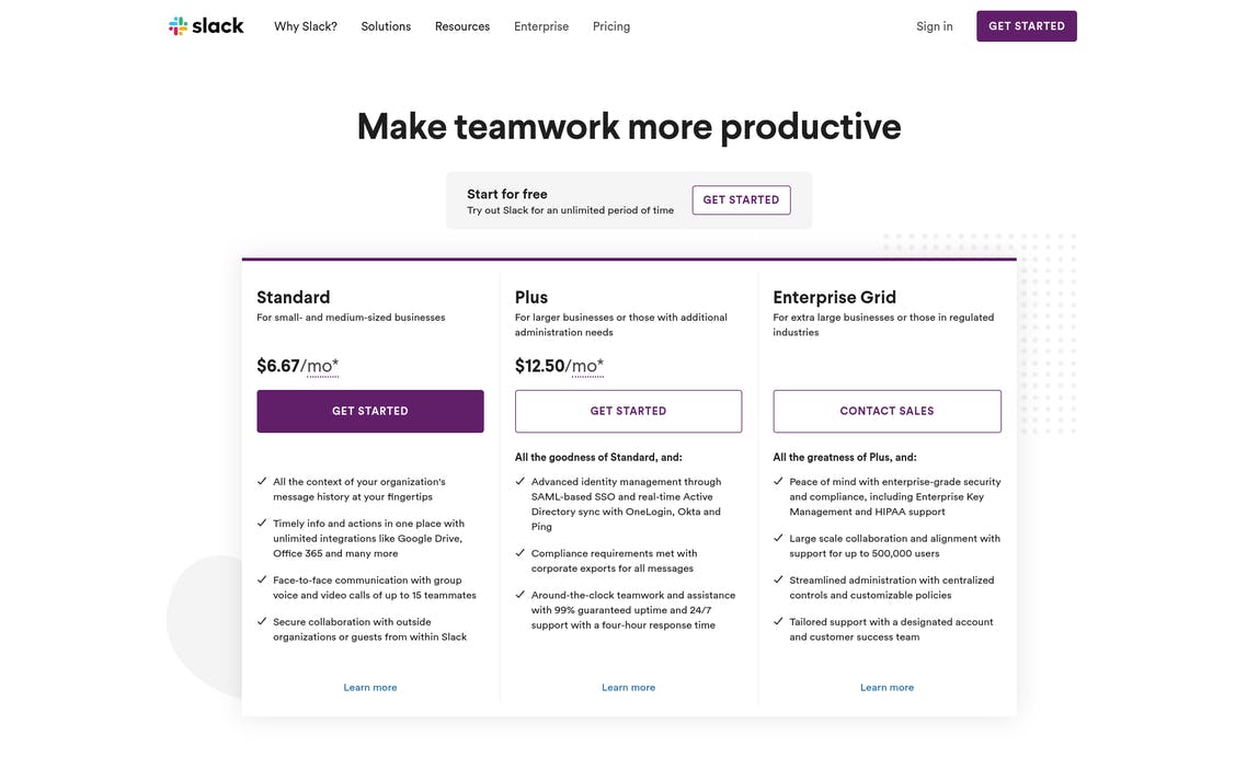
The tiers are well-structured, with the features provided by each tier clearly laid out. New buyers have a choice of three tiers:
- In the Free plan, you pay $0 per month but are restricted to “10K of your team's most recent messages” and “10 third-party or custom integrations.”
- In the Standard plan, you pay a maximum of $8 per month, but message searches and integrations are unlimited.
- In the Plus plan, you pay up to $15 per month and get unlimited searches and integrations, as well as enterprise-level services such as single sign-on, compliance reporting, and guaranteed uptime.
Slack’s pricing also aligns perfectly with their value metric—not more seats in Slack’s case but a longer message history. Once teams start using Slack more, with more members of their team, the ability to go back and search messages and files becomes more valuable, as do integrations. And for larger companies with 50–100+ employees, things such as compliance reports, SLAs, and support become more important. Each tier is designed to fuel growth and provide the precise value needed by that level of customer.
Is your pricing page effective?
Even if you follow all five best practices in your own pricing pages, there’s still a strong chance you won’t get it quite right on the first attempt—after all, pricing is a process. How do you know, then, if your pricing page is actually doing its job?
As usual, it all comes down to data. Customer surveys are great for optimizing your pricing page in the early days, but these quantitative metrics can give you insight into how you’re doing once you start down the website optimization path:
Time on page
Are people spending 25 minutes trying to read through your incredibly long pricing page? Longer time-on-page can often be an indicator you need to simplify your design and align your tiers with buyer personas to ensure potential customers can easily find the right tier for their needs.
Bounce rate
If people are leaving right after getting on your pricing page, it might show that it needs a change. Either they’re getting turned off because you’re not open about your pricing or that pricing doesn’t align with the value your product provides to the customer.
Conversion rate
Conversions meaning “a person click X button”—specifically for your pricing page; this is usually a call-to-action button to either sign up for a trial, a paid account, or request a demo (depending on the scale of your service). Low conversion rates are a clear sign your pricing page isn’t as effective as it could be.

Take the headache out of growing your software business
We handle your payments, tax, subscription management and more, so you can focus on growing your software and subscription business.
Don’t make pricing page design an afterthought
For too many SaaS startups, pricing page design is an afterthought. They put tons of effort into their product design, but no effort into the most important page potential customers are going to see before getting to the product.
Your pricing page is too important to slap together and hope for the best. Instead, follow the best practices from our top pricing page examples—price by value, keep things simple, and align tiers with buyers—and you’ll be well on your way to a solid pricing page that converts.